-
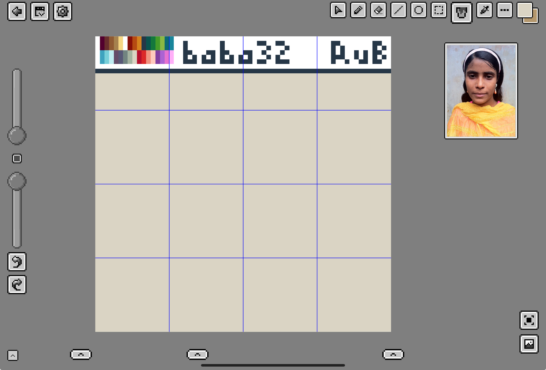
I have today’s work cut out for me with this portrait of a Bangladeshi girl from 2011.
👾
-
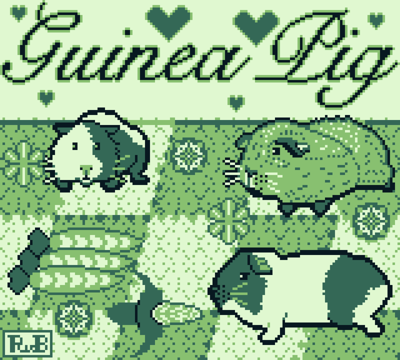
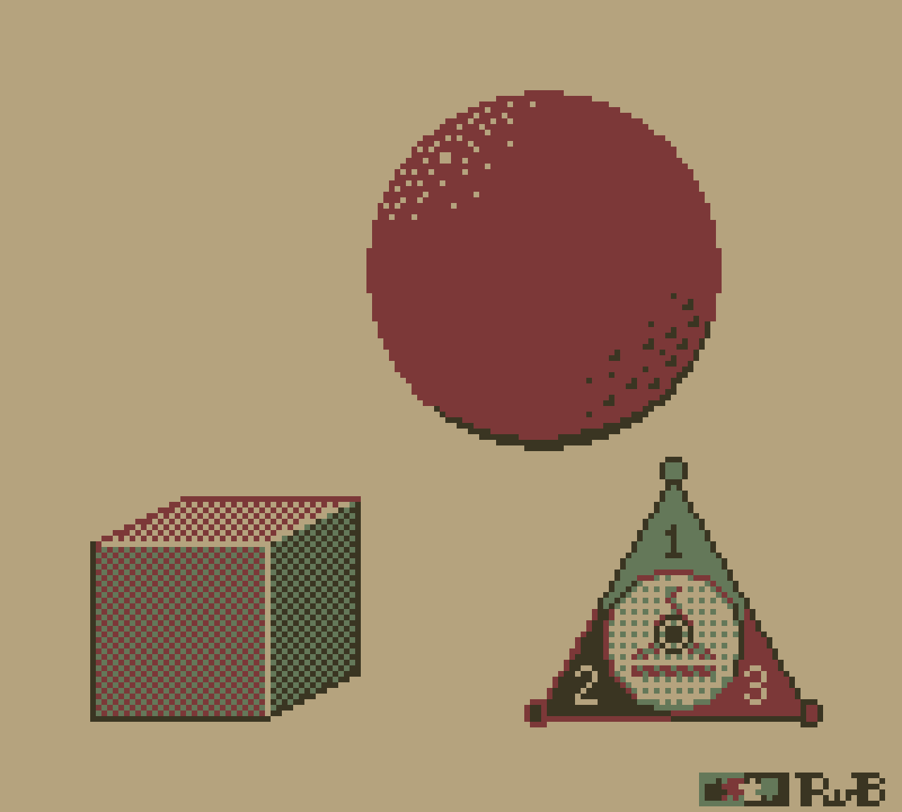
Practicing dithering.
👾
-
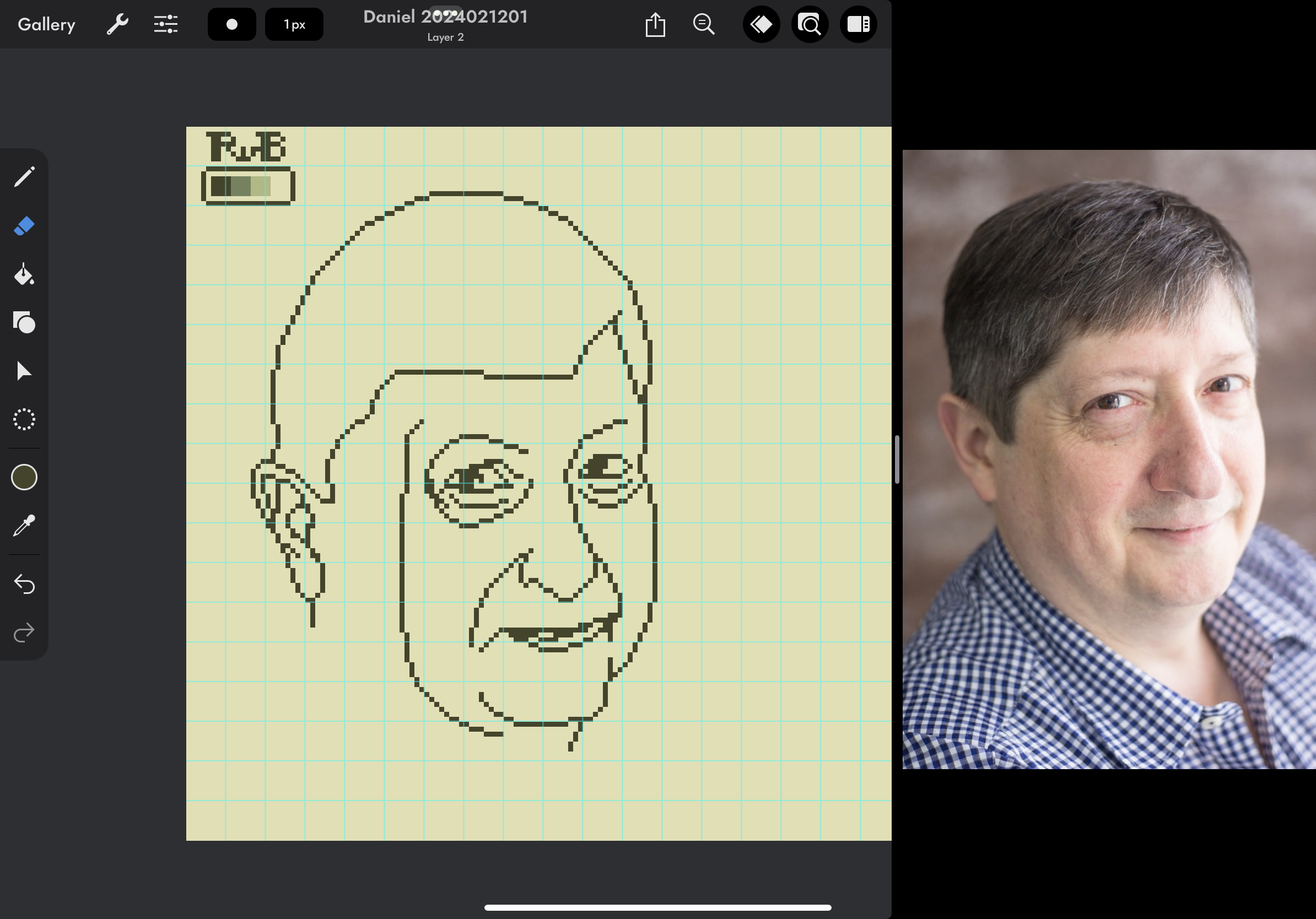
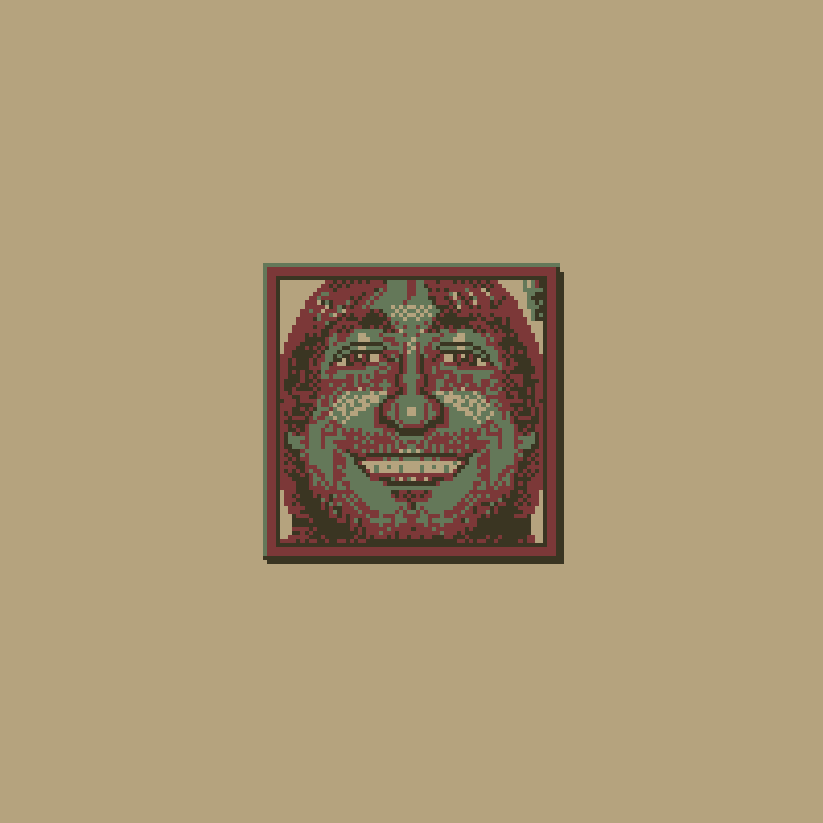
I made this 64 by 64 pixel art portrait, referencing this photo of Raymond and using only four colors from the 2-bits-pips color palette.
👾
-
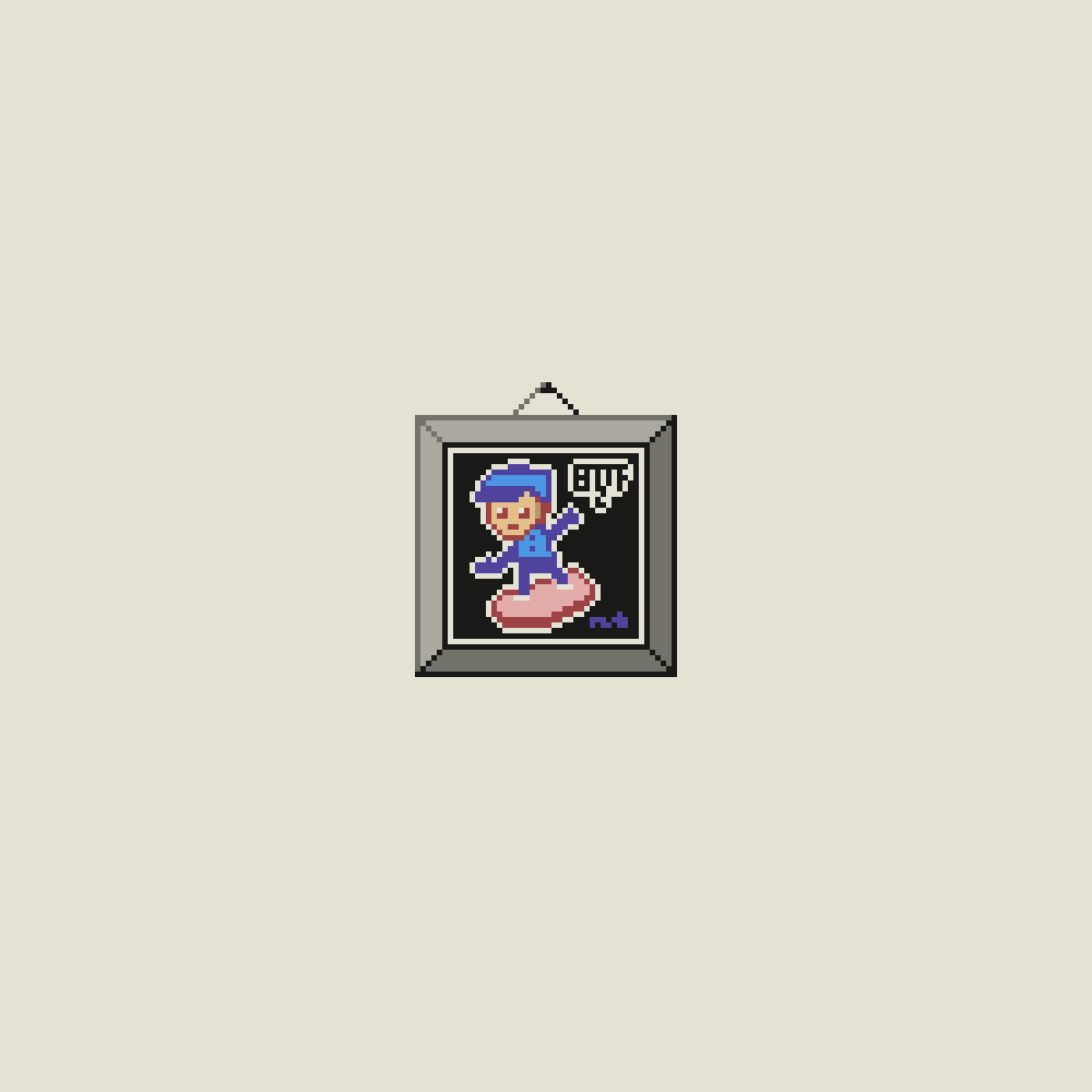
Drawn while listening to A Legacy of Biffs on The Incomparable Mothership podcast about Back to the Future 2. It’s an audio podcast, so I got to draw from imagination.
👾
-
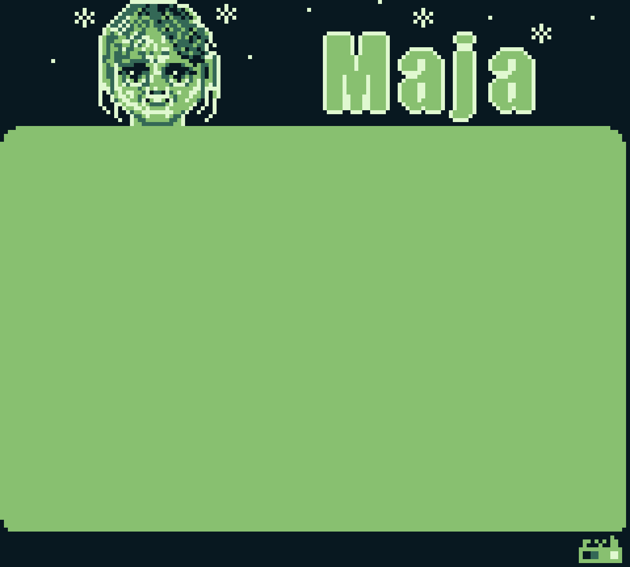
I made this Game Boy compatible pixel art piece based on this excellent portrait.
👾
-
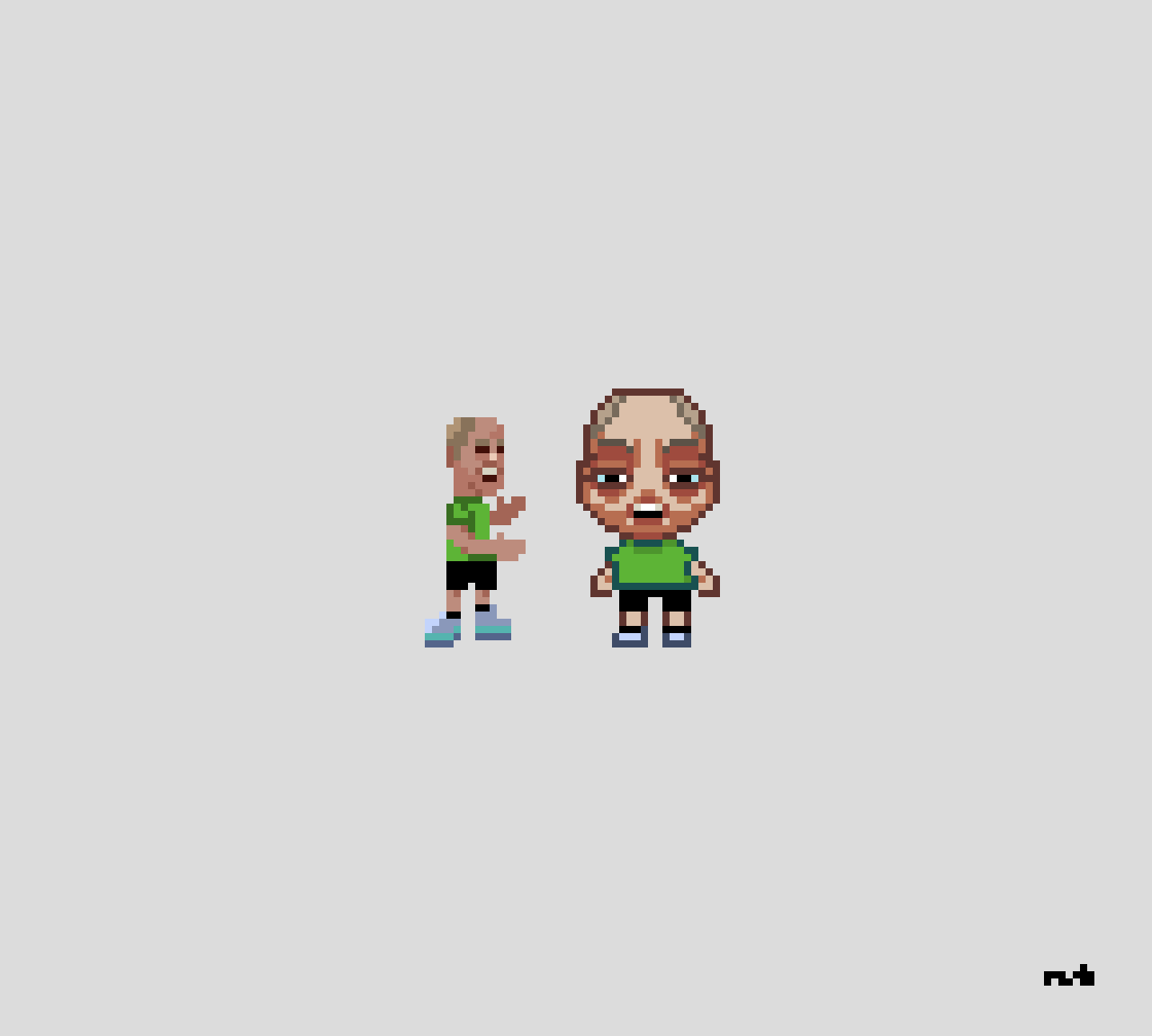
I tried drawing the same character in two different art styles, referencing a photo I took myself. The one on the right is (loosely) based on someone else’s art style.
👾
-
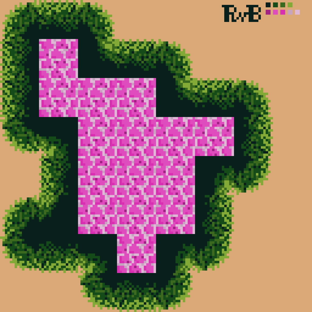
Oh boy, I need to learn about tilesets and game art to avoid attrocities like this one
👾💩
-
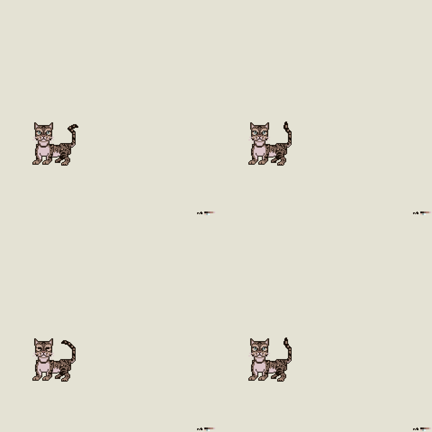
I tried to create an animated sprite of my cat. All I have to do now is give him a world to live in. That’s easy, right? 😂
👾
-
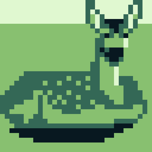
I used this photo as a reference for a small pixel art drawing of a deer. I tried to concentrate on clumps of pixels, but I see I need to study more to be effective. The shape’s okay-ish, which is an accomplishment at this scale, I think.
👾
-
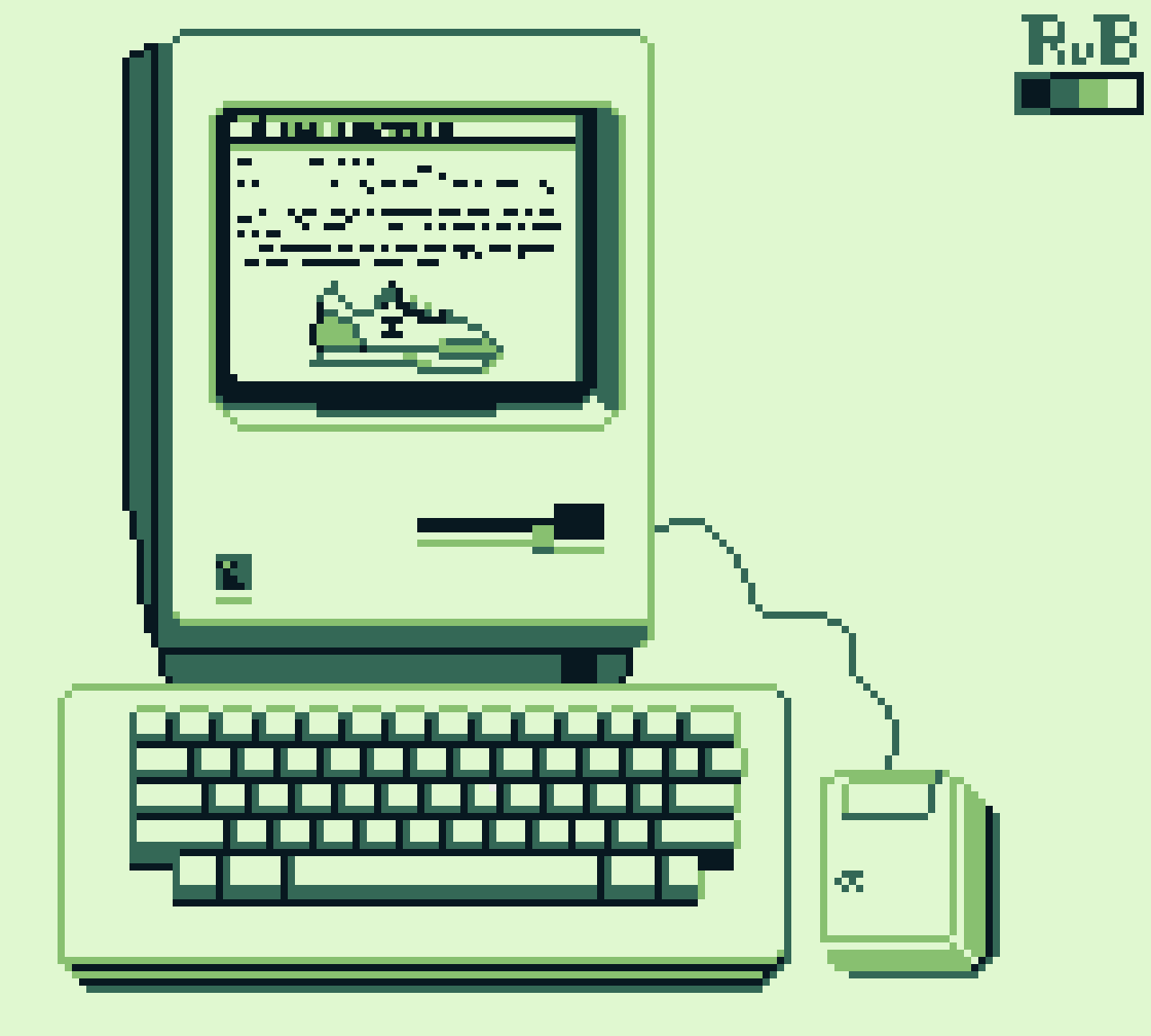
The original Macintosh, aka 128K Mac, is often referred to as the computer that changed the world. It was the first commercially available computer with a graphical user interface. Pixel art for the Nintendo Game Boy screen (160 x 144 pixels, 4 shades of green).
👾
-
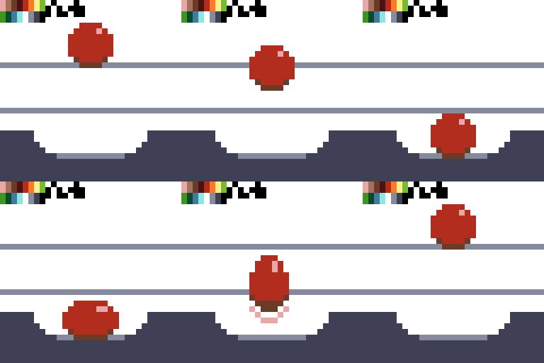
I thought pixel animation would be easier. Alas, with iPadOS it still is too hard, so it seems, and Aseprite is still the desktop app to emulate. Yes, you can do animation on the iPad, but it takes a lot of time compared to what I’m used to on the desktop 20 years ago, using Moho.
👾
-
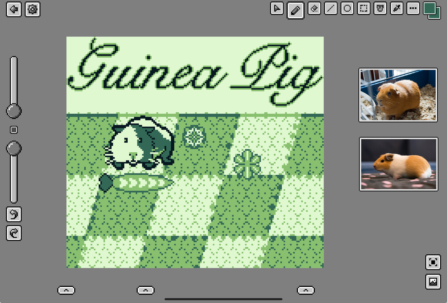
My reason to share a work-in-progress shot is to set a milestone, so I stay motivated working on the piece. Since I share it publicly, it also keeps me honest. Now I have to finish it.
👾
-
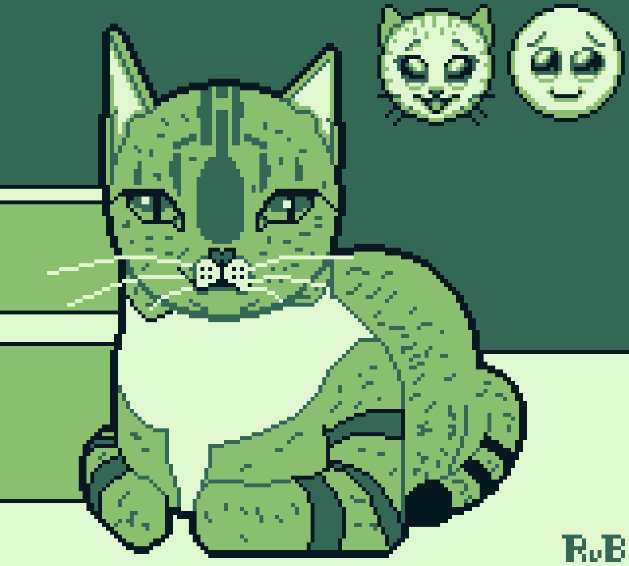
Pixel art version of this reference photo. I simplified the shapes so it was easier to draw on such a small canvas and so few colors (160 x 144 pixels, 4 shades of green). I think it got the message across, though.
-
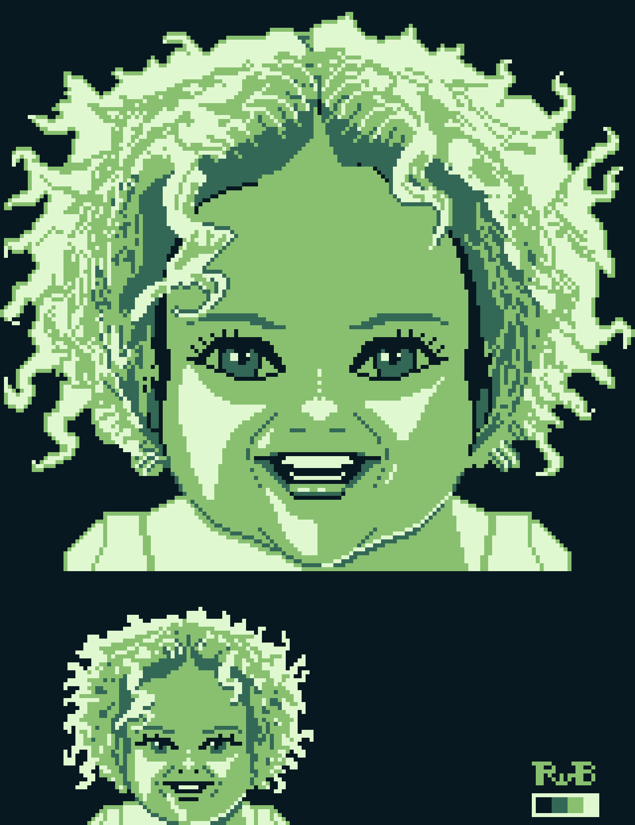
I used this photo as my reference for both a 160 x 144 and 64 x 64 pixels versions of this portrait. I went for a more anime art style, which made the likeness suffer a bit.
👾
-
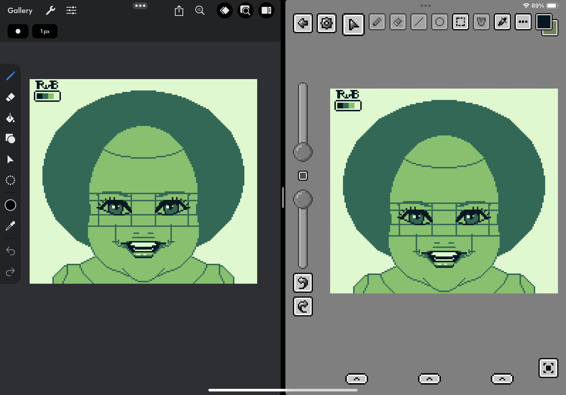
Besides changing my color palette I also bought (unlocked) a new pixel editor I hadn’t heard of before, Pixquare. There are others, but this one and Pixaki seem the most user-friendly. Some apps are just pushing too hard into in-app purchases. The harsh greens are a bit off-putting, though.
👾
-
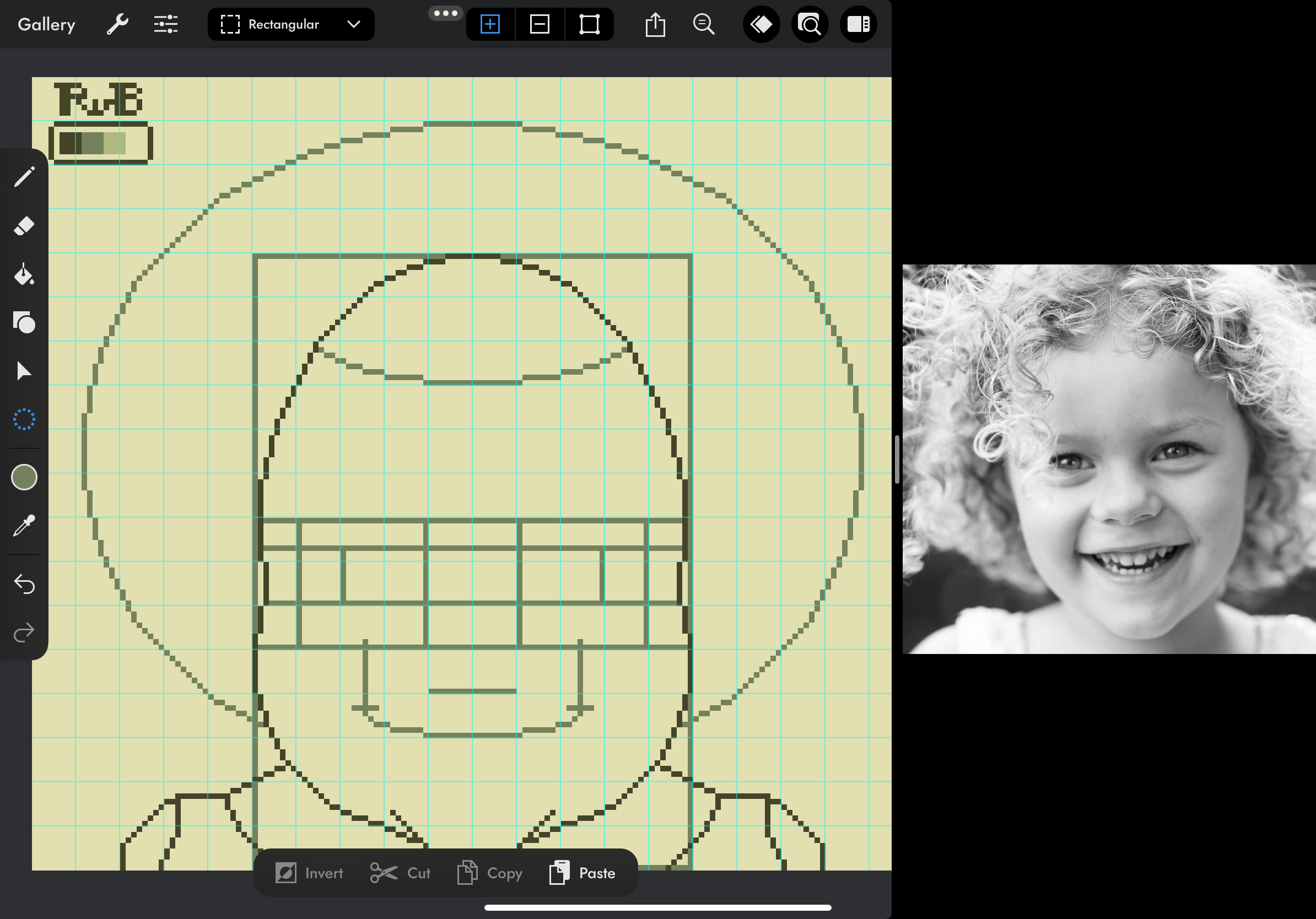
Pixel art study, WIP. I hope I got the proportions right this time for a semi-realistic style drawing, nudging towards an anime art style. At least, that’s what I’m going for. I’m taught that studying proportions is key for a successful portrait drawing. Next, I want to simplify it into 64 x 64.
👾
-
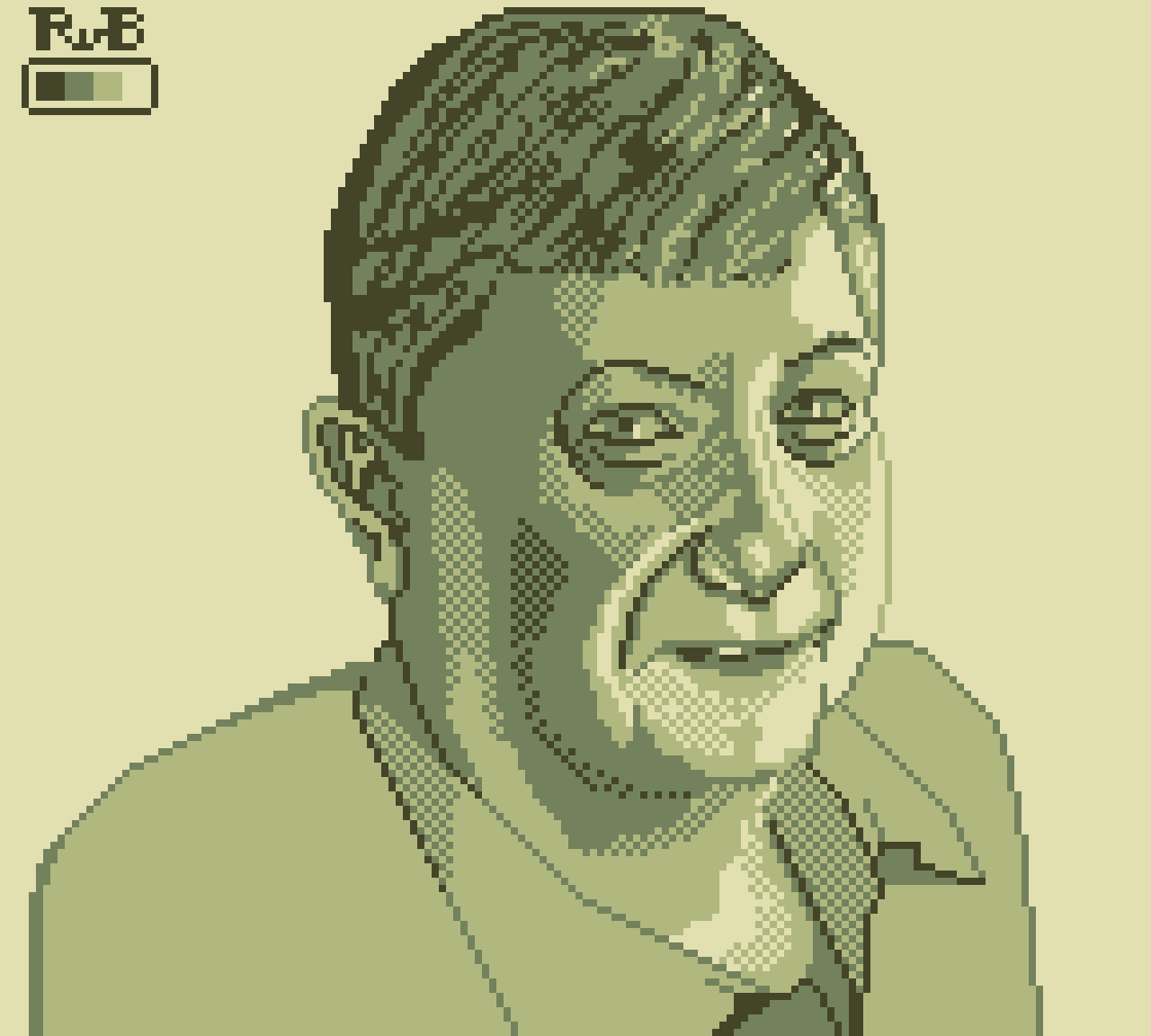
Portrait study in a more realistic style, based on this photo and in Game Boy format (160 by 144 pixels, 4 shades of green).
👾
-
A very rough work-in-progress of a Game Boy compatible pixel art portrait study. I’m struggling to get the proportions right without tracing. As with any realistic portrait, it takes time and patience, measuring, a lot of zooming, and breaks for a fresh look, as well as accepting I’m not perfect.
👾