-
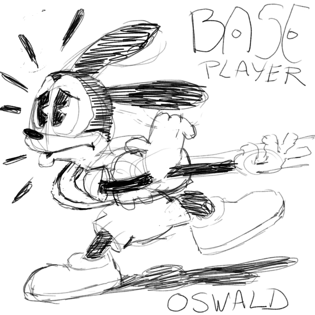
I want to create a pixel art animation of Oswald the Lucky Rabbit (out of copyright) playing the base guitar. I can’t play the base, draw Oswald on-model, nor know what a base guitar looks like. Trying nonetheless… (work in progress)
-
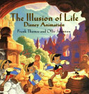
Finished reading: The Illusion of Life by Frank Thomas 📚
I finished this tome, finally! There’s a lot of pointers in this book to help with studying animation concepts. You won’t find exercises, nor tutorials in here, though there are many examples of the thought process of seasoned animators.
-
On February 15 we celebrate those who are happily single, me included. There’s no need to explain one’s preferences, nor any need to conform to old-fashioned societal norms. 🎨👾
-
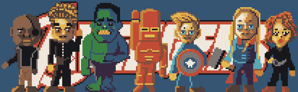
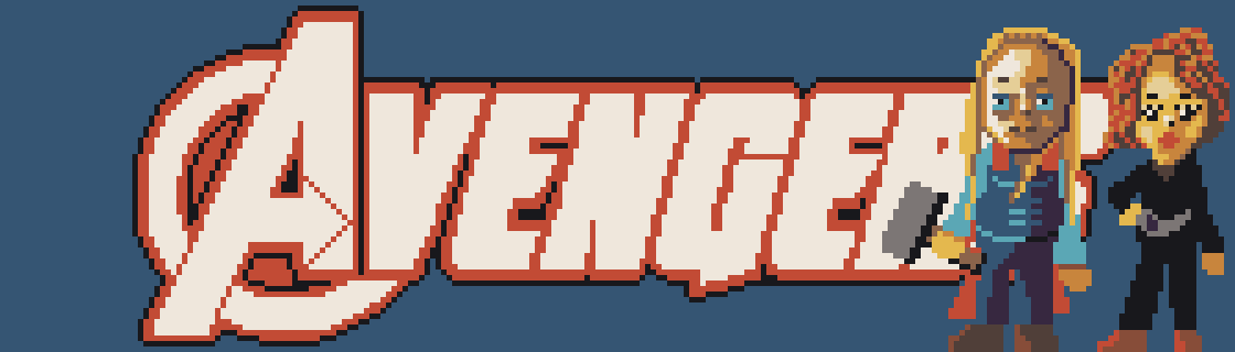
Here’s the finished fanart pixel art piece, I called “Avengers Assemble.” 🎨👾
-
Some pixel art pieces take a long time to make. Two done, still five to go. I might even do a pixel mini-series.
-
I don’t like a root canal treatment, especially the after-pain is quite intense. There is a second sitting in one and a half week, with probably the same worrisome three days period of not getting much sleep despite painkillers. My marathon training is heavily influenced. I canceled my long run.
-
I have to remind myself, that some individuals are on social media to be mean, for lack of appreciation of social etiquette. If you block them they get furious, because in their mind they are the good guys. Mind you, even Al Capone thought he was a descent person. It’s those who doubt who often are.
-
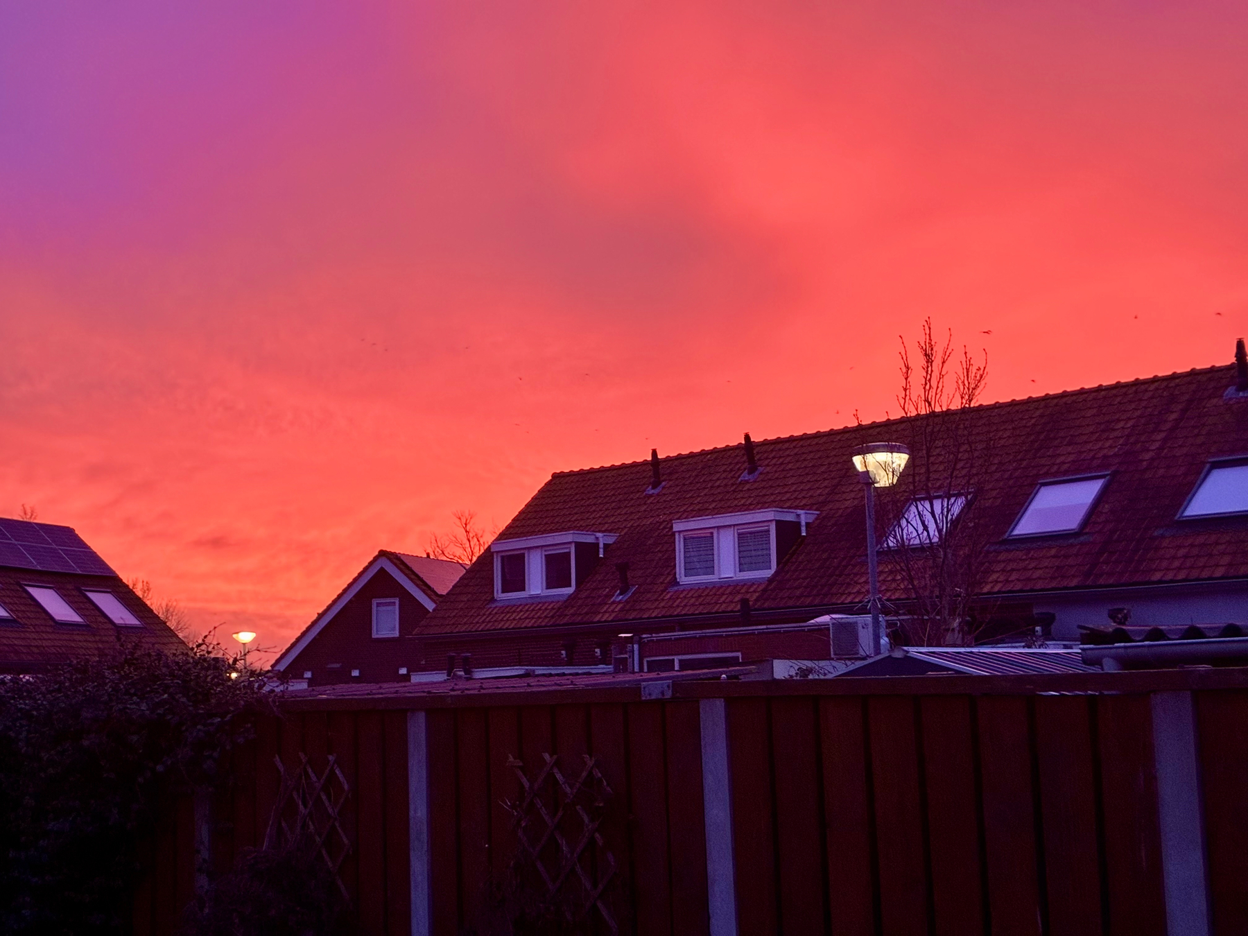
Beautiful sign of pollution.
-
An art contest based solely on likes, is a popularity contest, which has little to do with art, nor technical quality, like concept, execution and presentation. You know, what results in commissions and hard cash. Those likes actually matter, the others by the general public, not so much. It’s lazy.
-
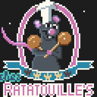
A new sign for a 3-star restaurant with a rat as its master chef. Free after the 3D animated movie Ratatouille.🎨👾
-
I was (heavily) nudged by Apple to upgrade to iPadOS 26 from 18. It works quite differently and I’m slowly getting used to it. It’s much better at multi-tasking, or should I rather say “multi-apping?” All I need now is a bigger screen, because shrunken apps aren’t optimized for it, at all.
-
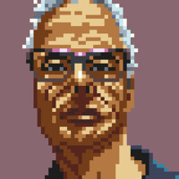
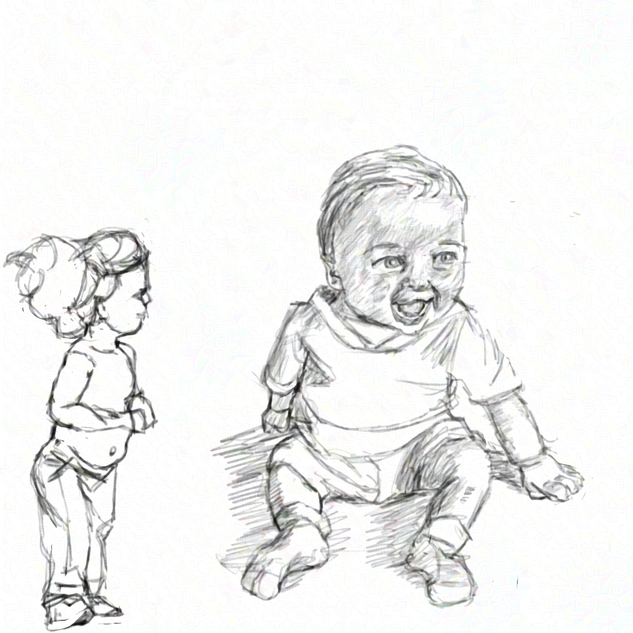
Taking more time, especially breaks between sessions, leads to great improvement, though there are still issues with these “eyesight copies” of photographs. I have no idea if—and how—this amount of detail could be captured in a 64x64 pixel art piece, and be animated as well. Maybe the head only.
-
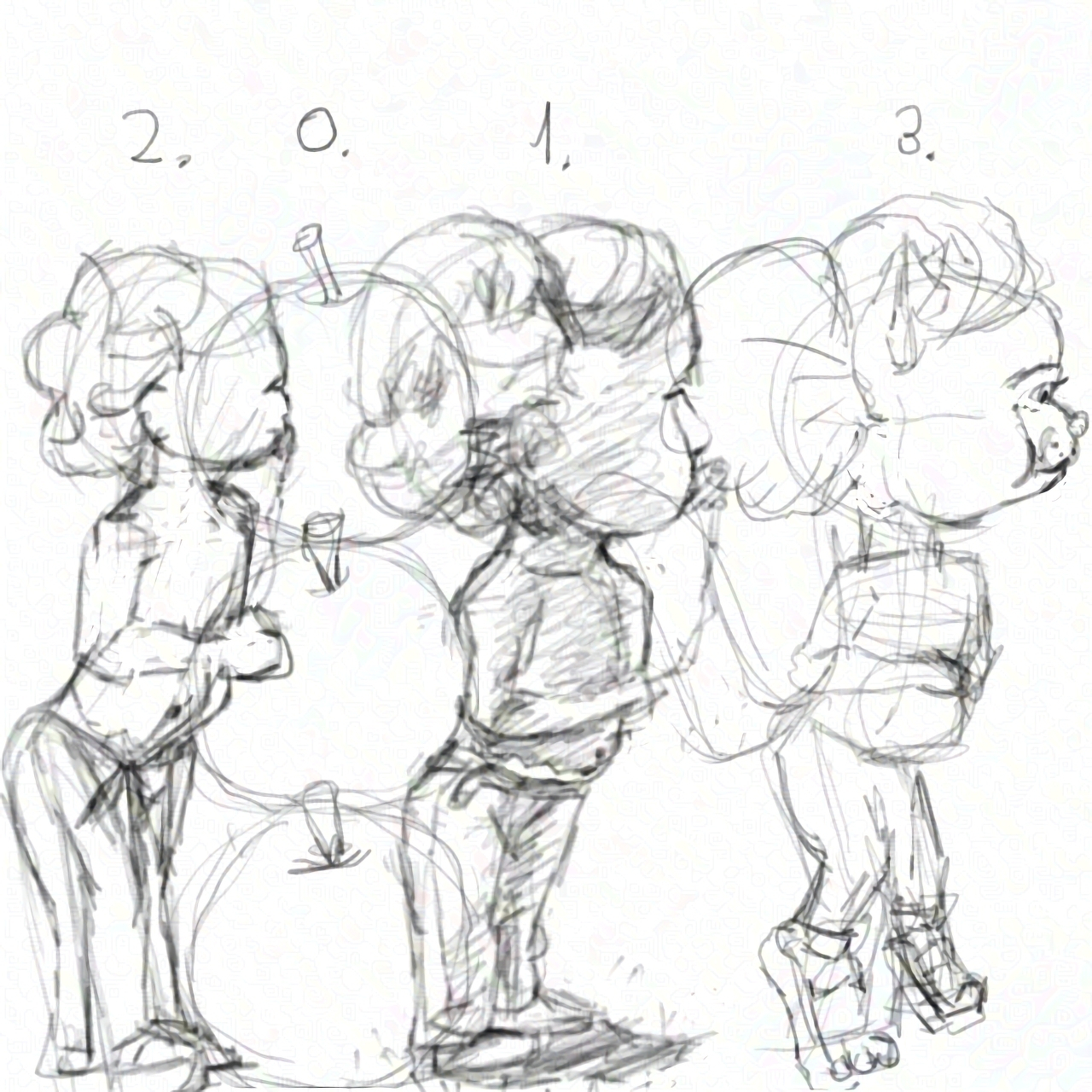
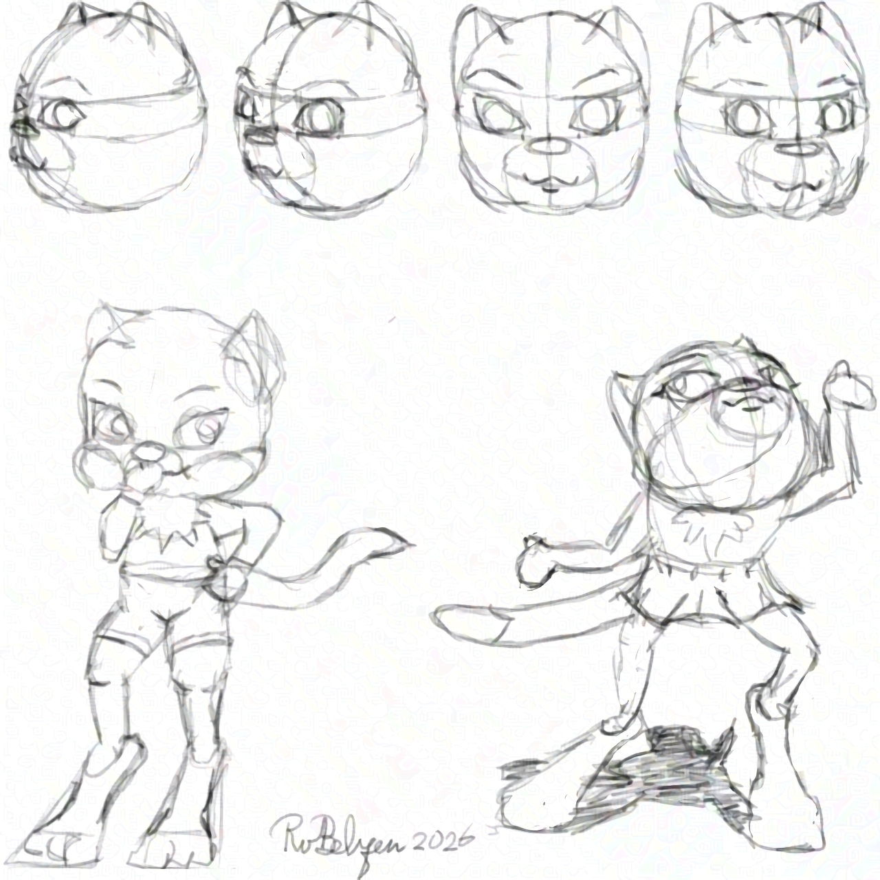
I’m starting to use CC photos of toddlers as references for my cat character. Problems mainly arise from not understanding the pose in the photo. Also real toddlers are four heads high, and I want to draw characters that are three apples stacked on each other in height.
-
Trying to solve drawing problems, and make this character “animateable.” Progress is slow, since I need to think things through. The aim is to simplify, and add more appeal at the same time. Still a long way to go, alas. Things will change radically.
-
My Most Popular Pixel Art On Divoom
On December 24, 2024 I received my Divoom Pixoo 64 and published my first pixel art design on the community’s servers. Since then I’ve made more than a thousand pixel art drawings, mostly at the Pixoo 64 resolution of 64 rows of 64 columns of colored LEDs for pixels. Not all were good enough (for me) to put on Divoom.
I only recommend the Divoom app and its community if you happen to own a device that uses the app. The community has a lot of non-artists, who are just there to favorite art made by artists, as to display it on their devices. There have been some incidents with trolling, and there’s no age limit, so you have your teenagers who lack the social etiquette of polite society and the wisdom that often goes with adulthood. I wonder if this is going to change with the introduction of age verification, which seems imminent in most Western countries with a conservative government.
Top 10 Most Liked
Here is the top ten (in reverse order) of the designs that received the most likes. I’ve included the caption, date, and number of views and of likes.
10. Nature
Another experiment with muted colors #64x64 9 March 2025 - 64x64 - 1.3K views - 96 likes
9. Made With A.I.
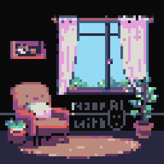
The design was based on a Dutch-language prompt: "Gezelligheid kent geen tijd." Of course, I redrew the whole thing at 64 x 64 and added scrolling text, as you do. I still got my 10 points 🤪 and more importantly, credit for another pixel art drawing instead of just one a day. 24 October 2025 - 64x64 - 2.2K views - 98 likes
8. Knight DK
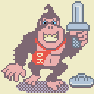
Not quite what I had in mind, but there's a time constraint and minimum quota to keep the Divoom Master Pixel Artist badge. 22 July 2025 - 64x64 - 4.5K views - 99 likes
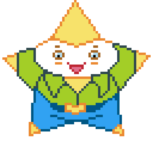
7. Star
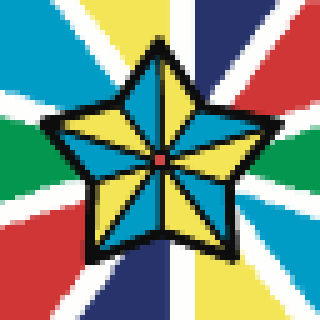
Another animation done in Callipeg, at 256x256 and scaled down (nearest neighbor) in Procreate to 64x64 pixels and then added the four red center pixels. 8 Frames at 25 fps, the fastest the Divoom app allows. All this to make a solid workflow. 12 November 2025 - 64x64 - 3.5K views - 104 likes
6. Squeaking Clean
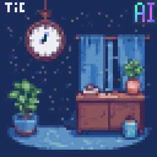
Edited Al art on the Dutch-language prompt: "Zoals het klokje thuis tikt tikt het nergens." 27 October 2025 - 64x64 - 2.2K views - 105 likes
5. The Naked Gun Movie Poster
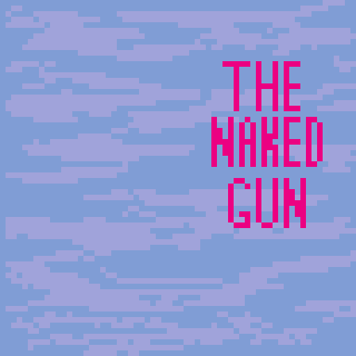
Perhaps the funniest movie ever made. 12 September 2025 - 64x64 - 2.7K views - 113 likes
4. Cat on a Carpet
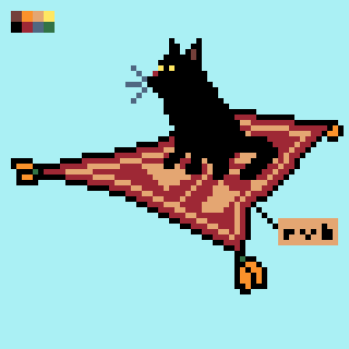
A piece I made for the Pixel Dailies prompt of February 26, 2021. #64x64 #cat #flyingcarpet 31 January 2025 - 64x64 - 2.7K views - 150 likes
3. Bubble Bobble
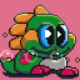
The little dragon from Bubble Bobble. I used 24 x 21 pixel art reference, presumably from the C64 version (found it through an image search). 2 September 2025 - 64x64 - 6.1K views - 256 likes
2. Oil Study

Time lapse of an oil painting in ibisPaint X. I used a reference by Karen Wilson. It's just a proof of concept of using other media as the basis of pixel art. 25 July 2025 - 64x64 - 5.4K views - 298 likes
1. Star Wars movie poster
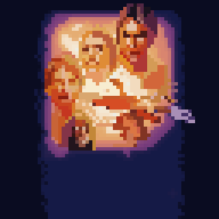
What a little tracing can do. The animation of the title was so much fun! 18 August 2025 - 64x64 - 6.9K views - 381 likes
Honorable Mentions
Here are some additional pieces that didn’t receive the most likes, but are still worthy of mentioning in my opinion. The designs are in no particular order.
Perspectively Rotating Cube
I found a Reddit thread on how to rotate a cube correctly in two-point 3D perspective. I traced the example and gave it my own spin. Sorry for the dad joke. Now it could be done for any object that can be drawn in perspective inside a cube, or inside several cubes on top of each other. 3 October 2025 - 64x64 - 2.1K views - 76 likes
Chibi Star Trek TOS
l used the stick puppets in the outro of the Netflix anime series "Qi Refining For 3000 years," and applied those on Spock, Kirk and McCoy of the 1960s SF series Star Trek (aka ST TOS). I hope you like it. 3 November 2025 - 64x64 - 1.5K views - 60 likes
Commodore 64 Ultimate
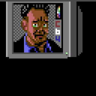
Thirty years after Commodore went bankrupt, someone has bought the brand and started producing official new 8-bit computers that are C64 in hardware, in which a field programmable gate array replaces the 1980s chips. That calls for a nostalgic celebration, since I owned several C64s in the 1980s and 1990s. 19 December 2025 - 64x64 - 2.3K views - 68 likes
-
I updated from 1Password7 to version 8 (payed account). Migrating the old version 7 vault to current was complicated, and hard to understand. I already knew that, and dreaded it so much that ending support for version 7 per 2026 was needed. It was as terrible as I feared, IOW, two hours of stress.
-
While the original Wonder Woman was a great movie, with high rewatchability value, Wonder Woman 1984 not so much. I watched it on Netflix and often paused because I was too bored to keep watching. Even when the pace picked up, the action was predictable, and boring. I think you can skip this one.
-
In the past 51 weeks I published almost 500 pixel art illustrations and animations to the Divoom community. Each took around 3 hours to create. So that is 1500 of the 10,000 hours (15 %) of intentional drawing, on my way to mastering the art of 64 x 64 pixel drawing, in about another six years?
-
I’m still amazed how many are on social media to gather likes and follows for status, and their interactions seem mostly performative, not genuine. I feel like being groomed to become these people’s follower. Luckily, not micro∙blog, which is much more relaxed and doesn’t expect user engagement.
-

Finished reading: A Confederacy of Dunces by John Kennedy Toole 📚 This was supposed to be funny, but I never laughed, nor chuckled. Ah well, I can recycle the book now, so someone else can read it. Maybe he or she will get it.