-
Drawing without reference can take you only so far. I guess I use it from now on, yet without wholesale copying.

-
Oh my! Is it December already? How time flies when you’re being lazy.

-
I found a tutorial on drawing hands and wondered how it would help me to improve. Hence this naive drawing of a hand from imagination without studying fundamentals beforehand.

Just drawing what one sees won’t improve one’s skills, that’s for sure. Some deeper knowledge is needed.
-
It appears November 1 is self-portrait day. Drawn at 160 by 160 pixels in ibisPaint X.


-
It’s Trick or Treat day. Gools, goblins, ghosts, and other ghastly creatures abound.

-
When inspiration seems to have vacated the premises of the brain, just draw, damnit, just draw! A need for the muse is for newbs, those who have never battled creative emptiness, out of fear or just mere mental illness. Succumbed to it many times, zapping energy and the will to live. Still here!

-
After dealing with a possible spammer (mute), I did another attempt on a fantasy animal, a cross between a cat and a dinosaur. Maybe it should’ve been a T-Rex, though 🦖

-
Started as a placeholder, I drew this in ibisPaint X from imagination. With references it would’ve been better, but as a drawing I’m pleased with it.

-
I wasn’t sure what to draw, until I read this post on my micro∙blog timeline. It inspired me to draw Deputy Dawg and the rabbit from “Dagnabbit Rabbit.”


-
Drawing while watching YouTube seems a great thing to do, until one realizes that the drawing takes more time than the runtime of the recorded video one watches.


-
Messing around with ibisPaint X features. It feels more like needlework with applying patterns than drawing.

-
I took a drawing I made in the (now defunct) French Girls app on my iPod Touch and made a new version in ibisPaint X at 160 x 160 pixels, almost 9 years later. Then I had a reference, not so now.

I hope those 9 years painting are noticeable.
-
How small a size can I get away with?

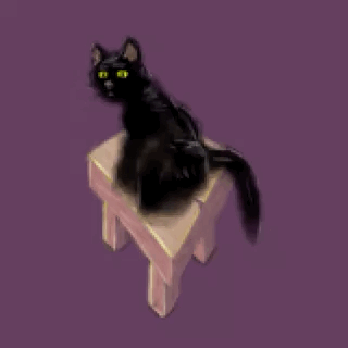
Does it still look like what I had in mind, a cat on a stool, at a fraction of 160 x 160 pixels?
-
The design of this cat seems too flat to get enough realism to relate to. Cats aren’t known for subtle facial expressions, since the appropriate facial muscles weren’t needed evolutionary. If real cats can’t emote like humans, studying real cats seems a dead end, though they can emote somewhat.

-
Describing (illustrating) and experiencing emotions are quite distinct. The former can be misrepresented and misinterpreted. Emotions are an involuntary response to a situation. Therefore, the trick seems to be to create clear circumstances that put the words and/or marks into the right context.

-
I tried animation in ibisPaint X again, and I can get it to export a single frame only. Either I’m doing something wrong, or the file export is broken on the iPad 9th gen. Frames can’t be exported as single PNG files either, so it seems a lost cause to try and animate with this painting app.

-
Learning about image size and how to stylize. I see how important it is to have a workflow, and not to overwork an image. Now I’m curious how Mastodon messes up my art. I already know micro∙blog displays artwork rather faithfully, because the developer cares about such things.

-
My first simple two-frame animation in IbisPaint X at a tiny scale (80 x 72 pixels). I had to assemble it in Pixaki to make it animate, since IbisPaint chopped off the second frame. It’s clear to me that animation was bolted on in a later version, not put in from the start.

-
I’ve been drawing on the iPad since they first came out. Back then there was no Apple Pencil and its fancy features, just your finger or a passive stylus. I hadn’t set up the stylus in IbisPaint X, and not noticed. Of course, with pressure sensitivity, drawing is much easier.
-
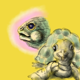
Three days ago I failed miserably at drawing a giant tortoise. Having done some simpler shapes, I was now able to capture a mediocre likeness, which is a huge improvement, in my opinion.