-
I suppose there’s no good replacement for solid practice and going through bad drawings before anything worthwhile appears. Also, that hour went by quicker than I thought. Now if I only had a lighter tough…
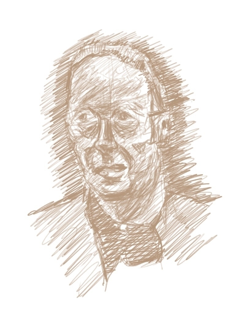
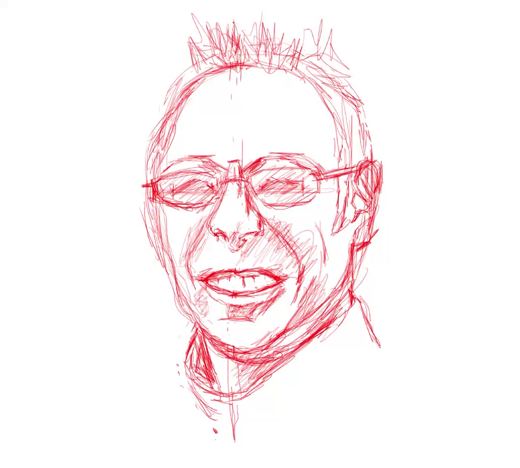
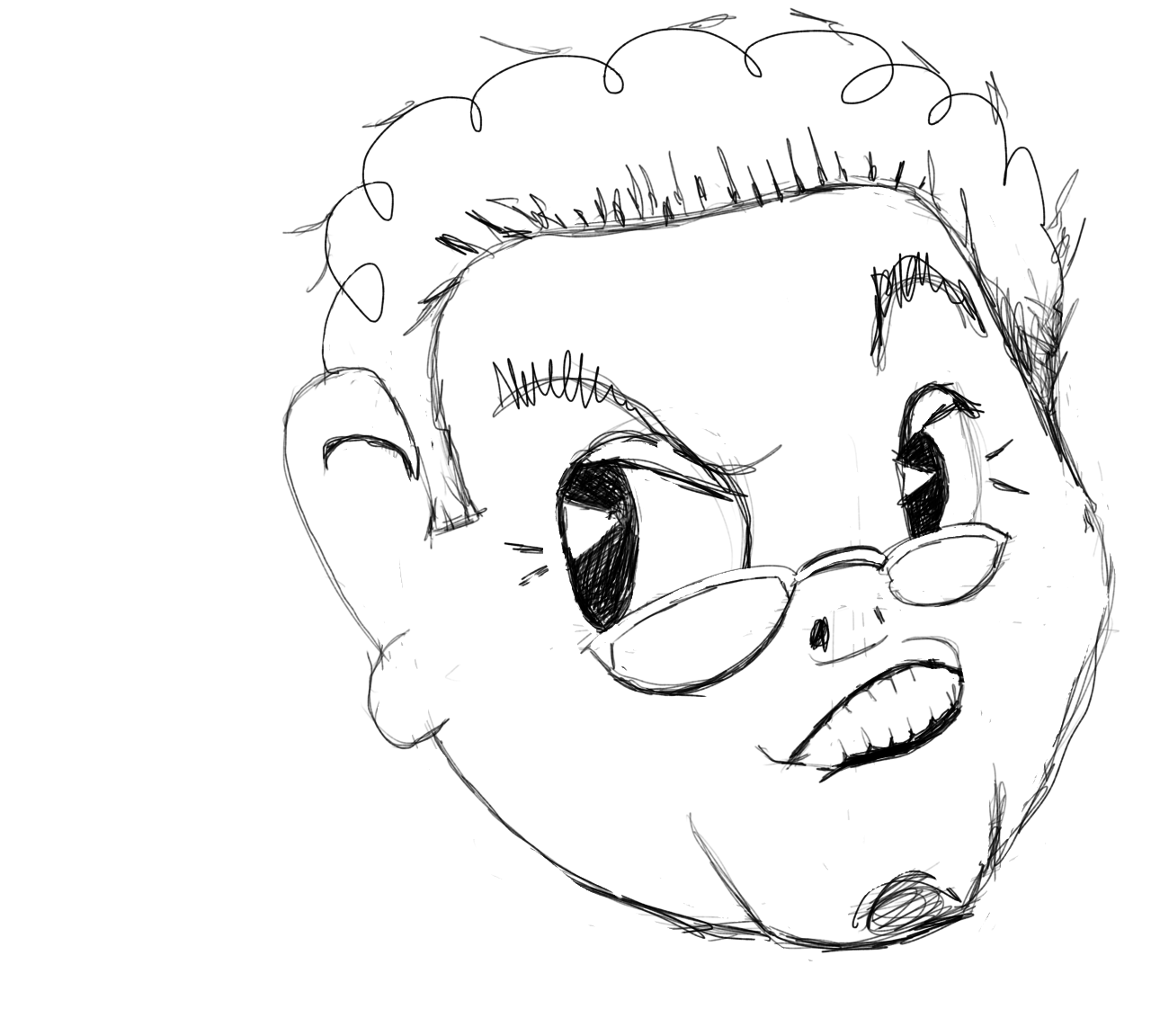
my attempt at Robert Vaughn as Napoleon Solo in The Man from U.N.C.L.E. -
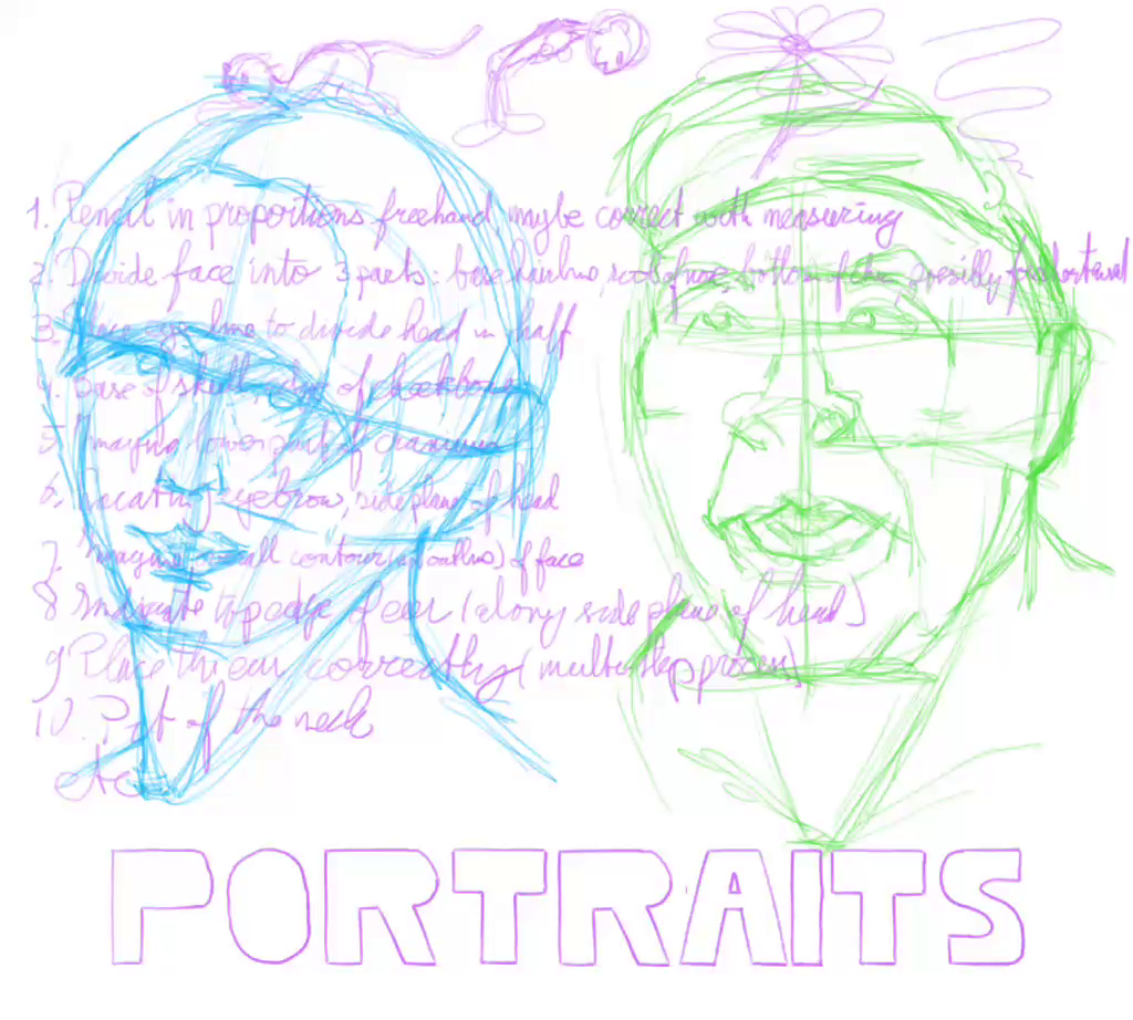
Even the first ten steps of a forty-steps process proved to be too complicated and requires more practice with each step, separate from drawing faces. This is going to take a long time to get good at, let alone master it.
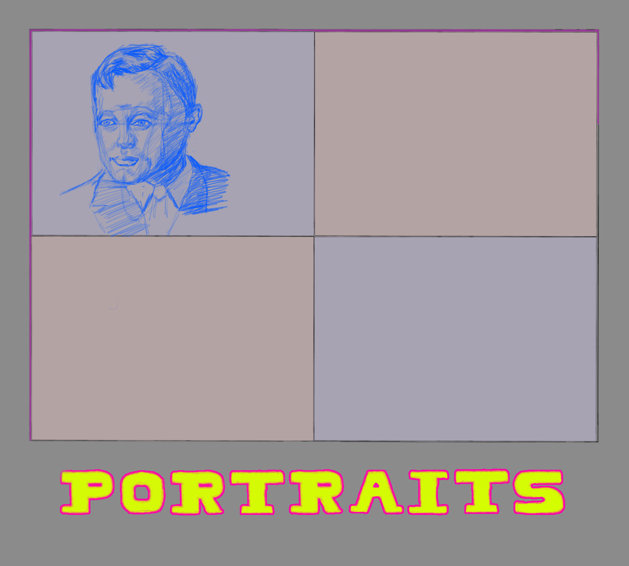
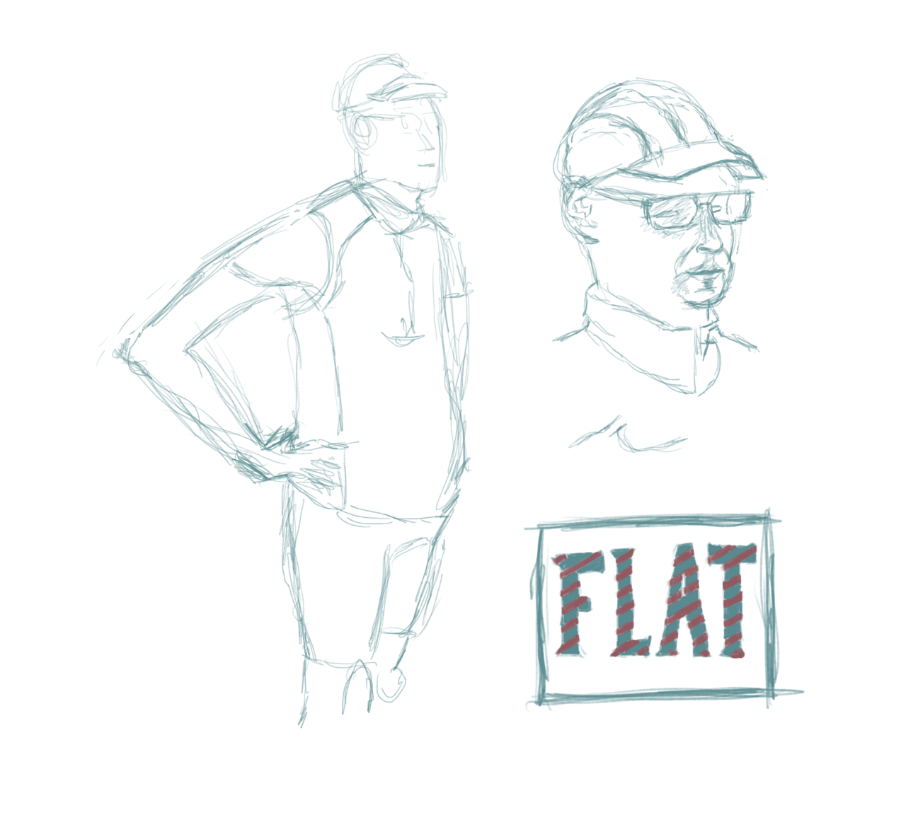
quick portrait sketches
process video of above drawing -
I’m trying to draw somewhat realistic portraits from photos. I found a 40-step tutorial, with each step requiring measuring and, frankly, a study on its own. I always had problems measuring angles and comparing distances, due to my glasses. A straight line turns into a curved line, and so on.
-
Without the tyranny of reality it gets much easier for me to draw people, though the stylized version is less convincing than a realistic art style. I need to find a middle ground, and then nudge it into more realistic.
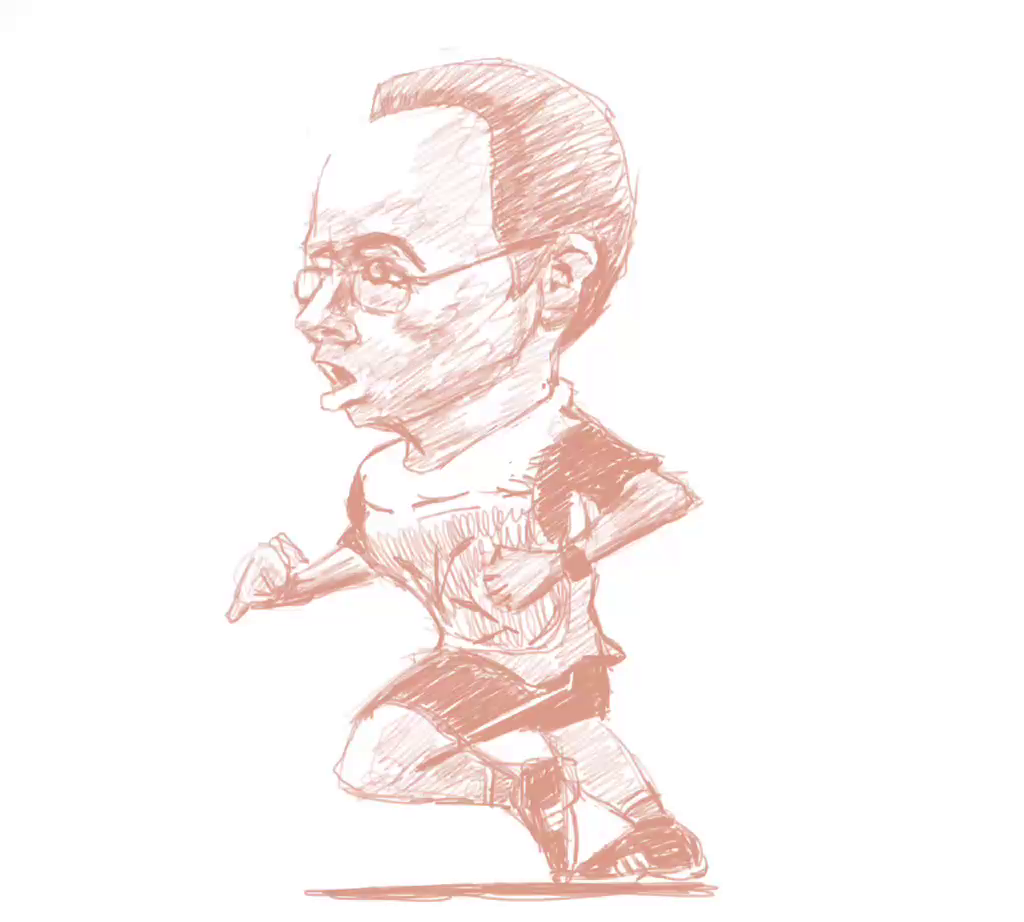
stylized version of a runner
process video of above drawing -
Apparently, a digitally zoomed in photo isn’t a good reference, and can lead to “imaginative” rendering by the artist. I did a lot of pre-drawing exercises to get rid of too much anxiety to finish quickly. Still, it’s rushed, not very deliberate. The more I try to calm down the more anxious I get.
-
After a little practice with lines and drawing contours from observation I can already see improvement in my drawing from a photo. I see the underlying structure and draw that, instead of the photo itself.
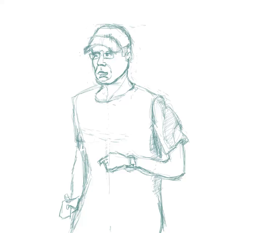
upper body sketch of smiling runner
process video of above drawing -
I’ve gone back to the Udemy course The Ultimate Drawing Course. Drawing fundamentals are essential and to be studied regularly.
I can see I need more practice.
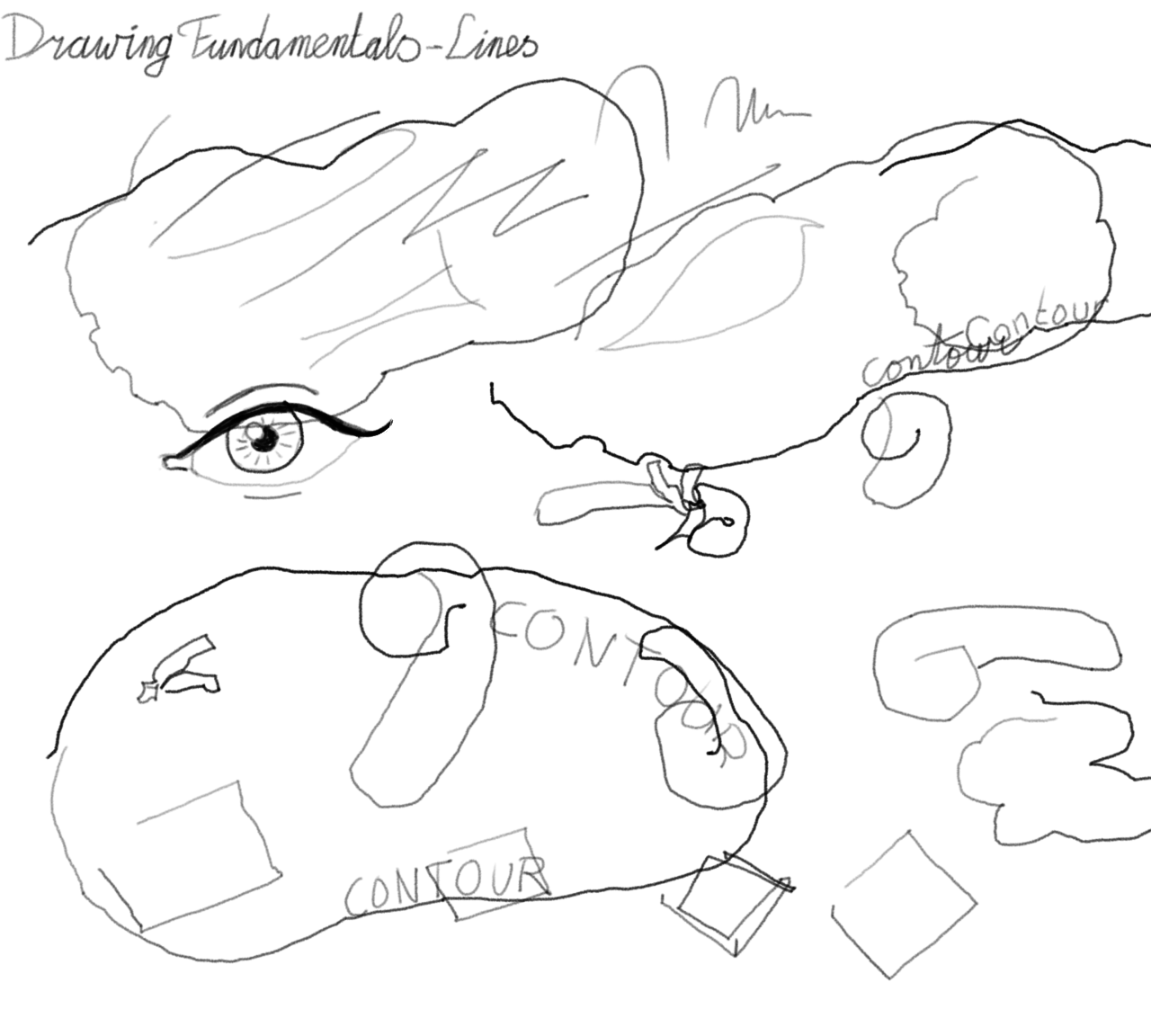
practice sheet with all kinds of lines and a few blind contour drawings from observation -
Drawing from direct observation is hard, especially on an iPad. It feels all clumsy and unnatural. While having the object in front of me, I’m mostly looking at the iPad screen, drawing wobbly lines. Those latter I should fix first, I guess.
somewhat drawn from direct observation -
I guess one can take drawing from photos only so far. At some point real life observations are needed to improve artistically. Much like practicing in front of a mirror requires an audience at some point to become convincing.
quick sketch confirming I need to draw from life instead of photos -
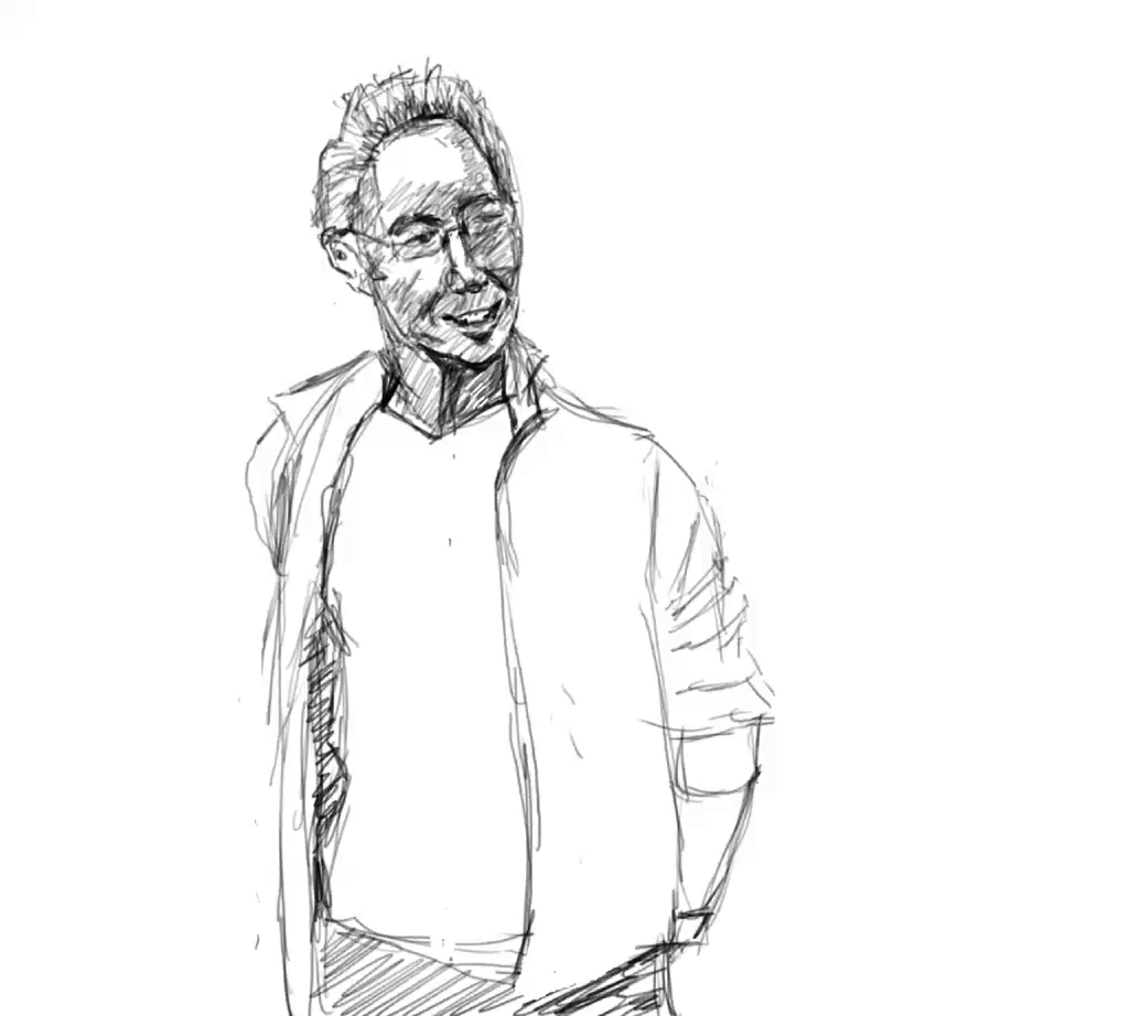
Quick sketch from a photo I took in 2017.
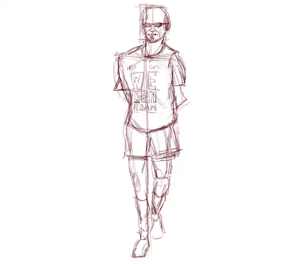
full-body sketch of runner in a casual pose wearing sunglasses
process video of above drawing -
I suppose doing these daily line drawings brings me closer to my goal of a realistic drawing. I should get looser, though.
quick sketch of a runner, partially obscured in the reference
process video of above drawing -
It’s clear to me that I need to slow down, considerably. It takes time to observe and interpret what your eyes take in. 28 minutes is just too short, but it’s progress.
quick sketch from photo
process video of above drawing -
After commenting with a pixel art version based on a sketch in ibisPaint X, I refined it, and put it in its own post. I can see what to improve upon, yet the general idea is there. AI alt description confirms it. Some learning to do now.
slightly more elaborate version of the original -
I’m a bit rusty after so many months of not drawing, so I needed a few weeks to be able to share something I’m not too embarrassed about. I know, it’s silly, because so few read this blog. The drawing is made on an iPad Pro (4th gen, 11 inch), using ibisPaint and an Apple Pencil. 🖌️
-
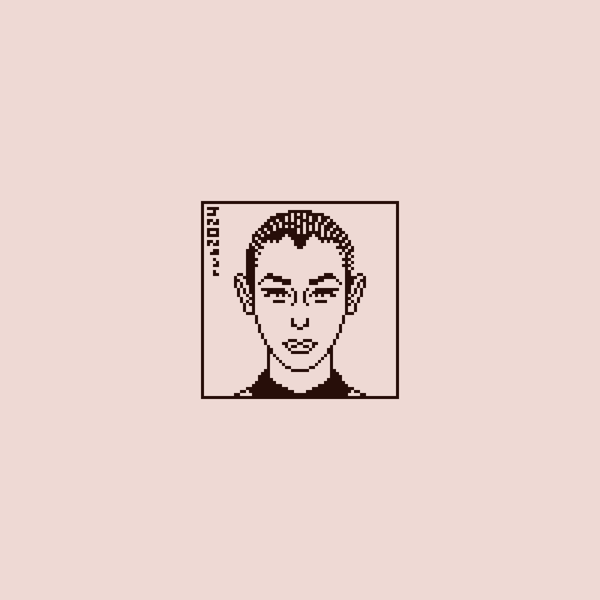
Pixel art portrait
👾
-
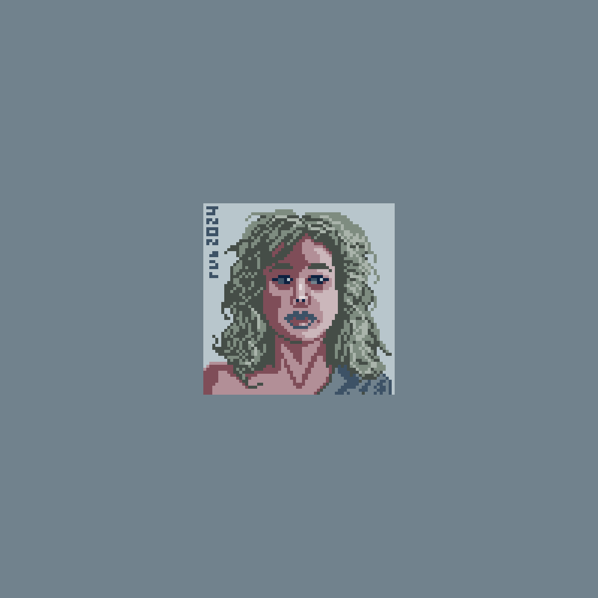
Yet another pixel portrait.
👾
-
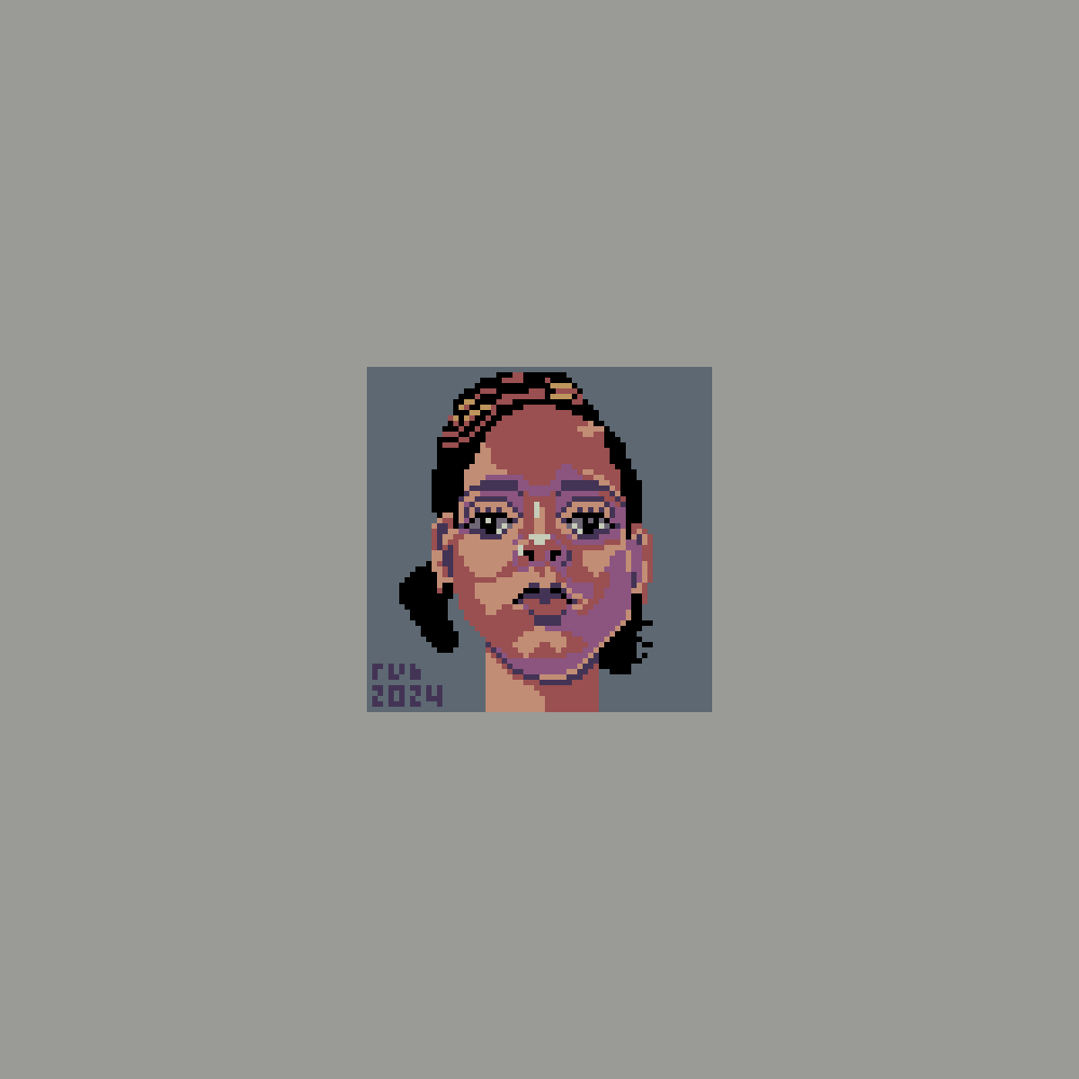
Pixel portrait.
👾
-
After a brief hiatus I started pixeling again.
👾
-
Pentecost literally means fiftieth. Since it’s 49 days after Easter, it is an example of an off-by-one error. Another is that for marking 10 distances one needs 11 distance markers, instead of 10.
👾 *️⃣🟰🗿➕4️⃣9️⃣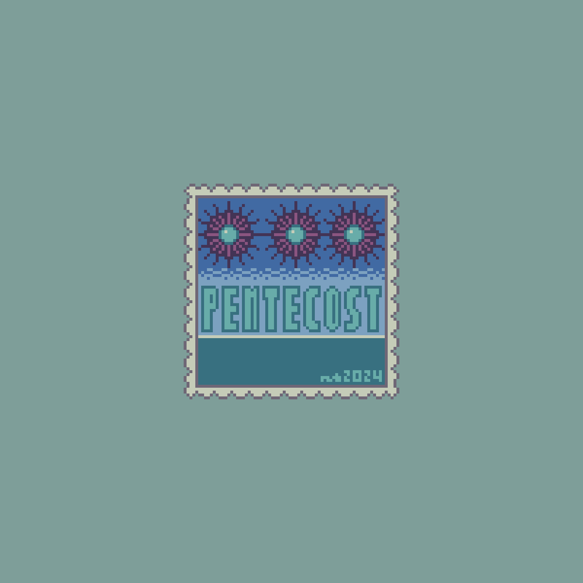
-
Apparently, genAI doesn’t know what to make of this.
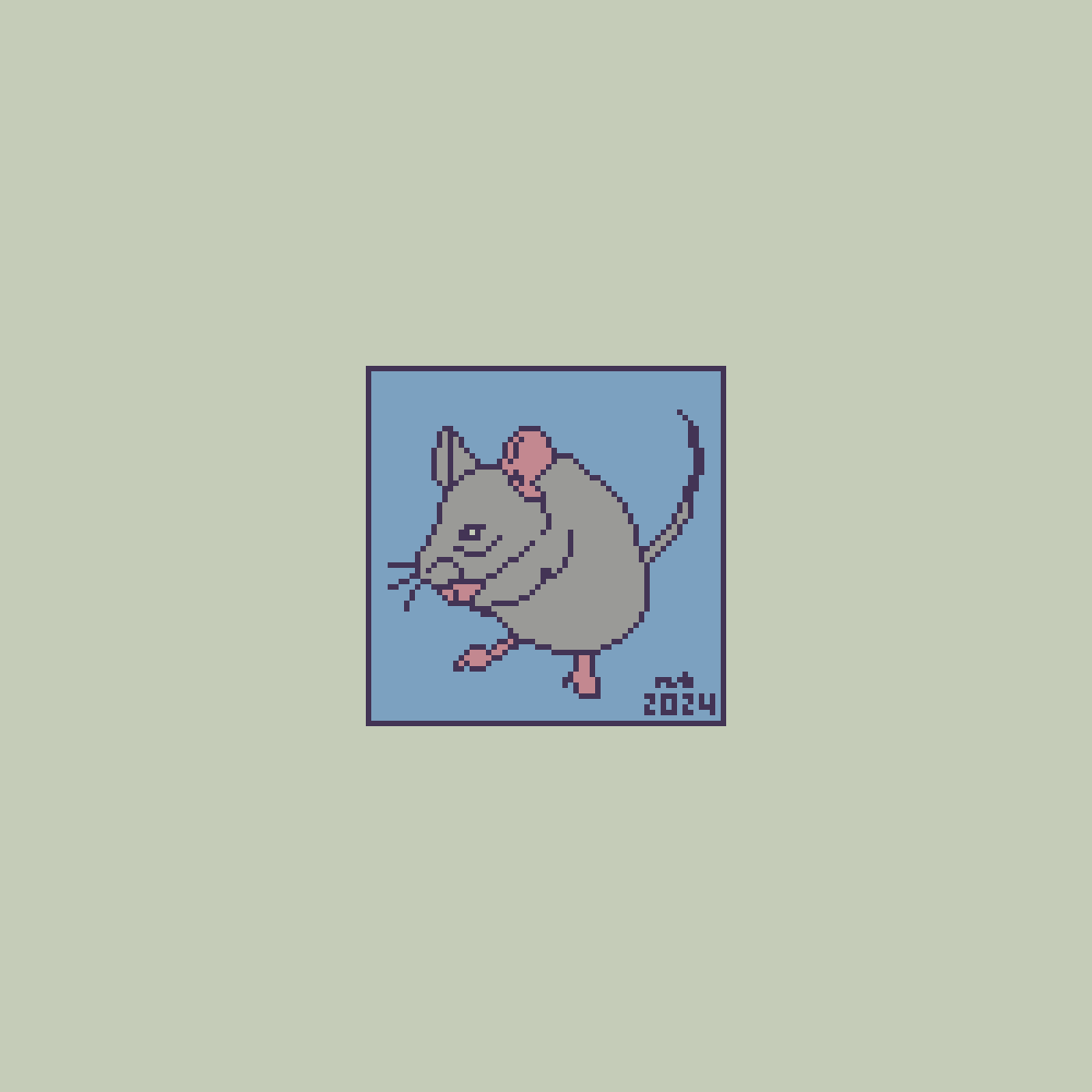
👾🐭